


![GettyImages-1176275556 [Converted].png](https://images.squarespace-cdn.com/content/v1/513d034be4b0abff73bd5b32/1667222077319-I71AC46VCRW3F4S8NNYV/GettyImages-1176275556+%5BConverted%5D.png)


49
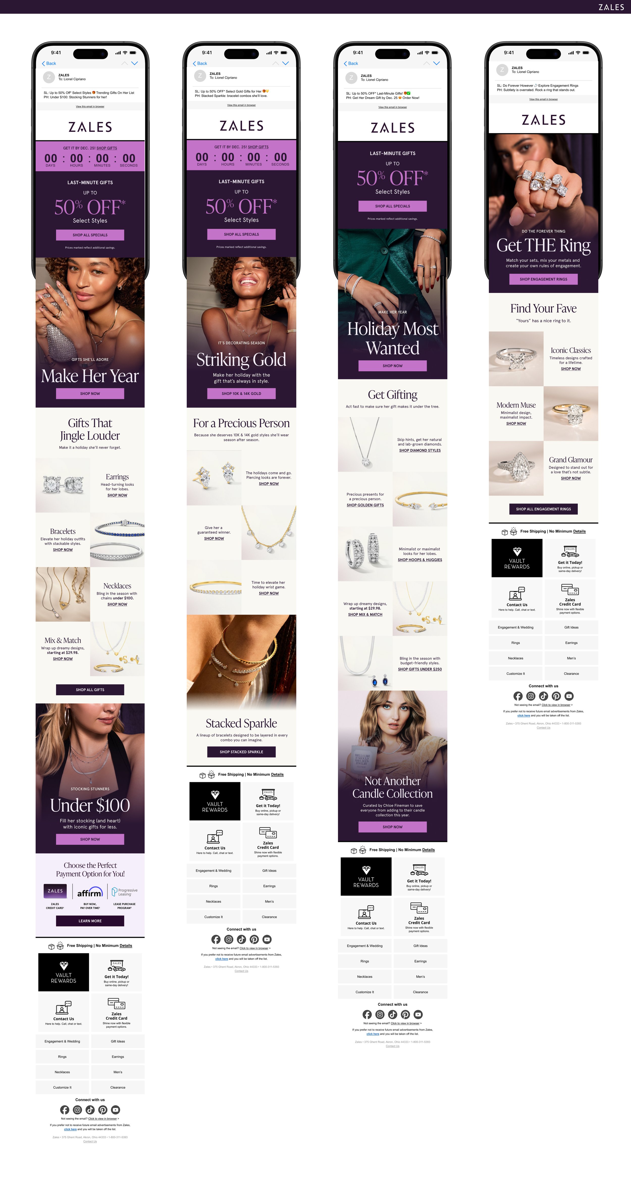
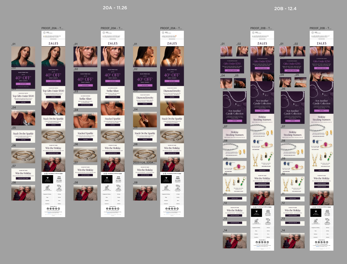
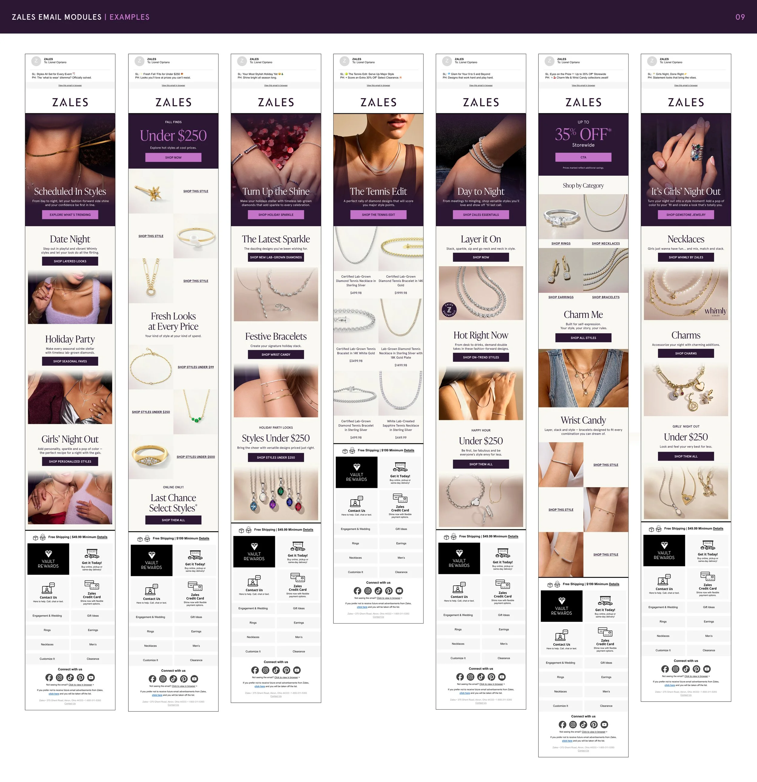
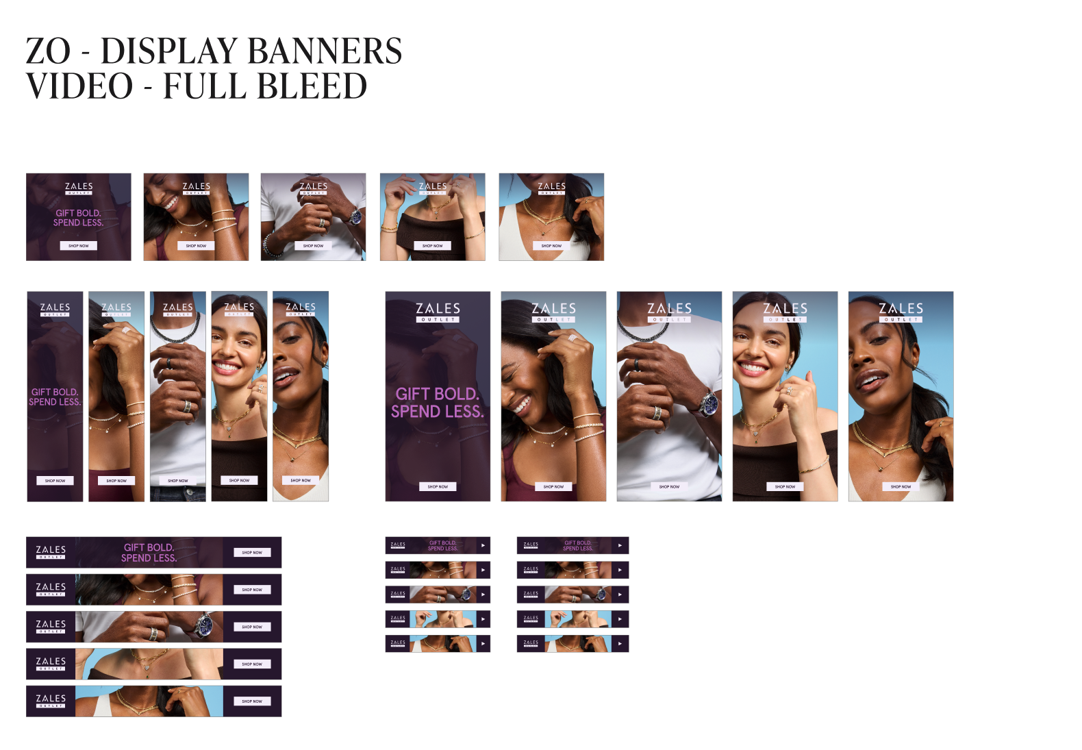
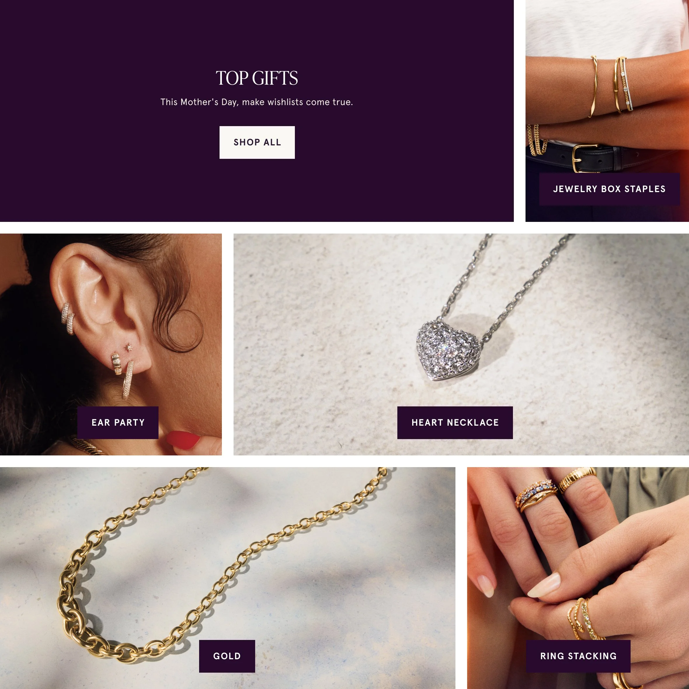
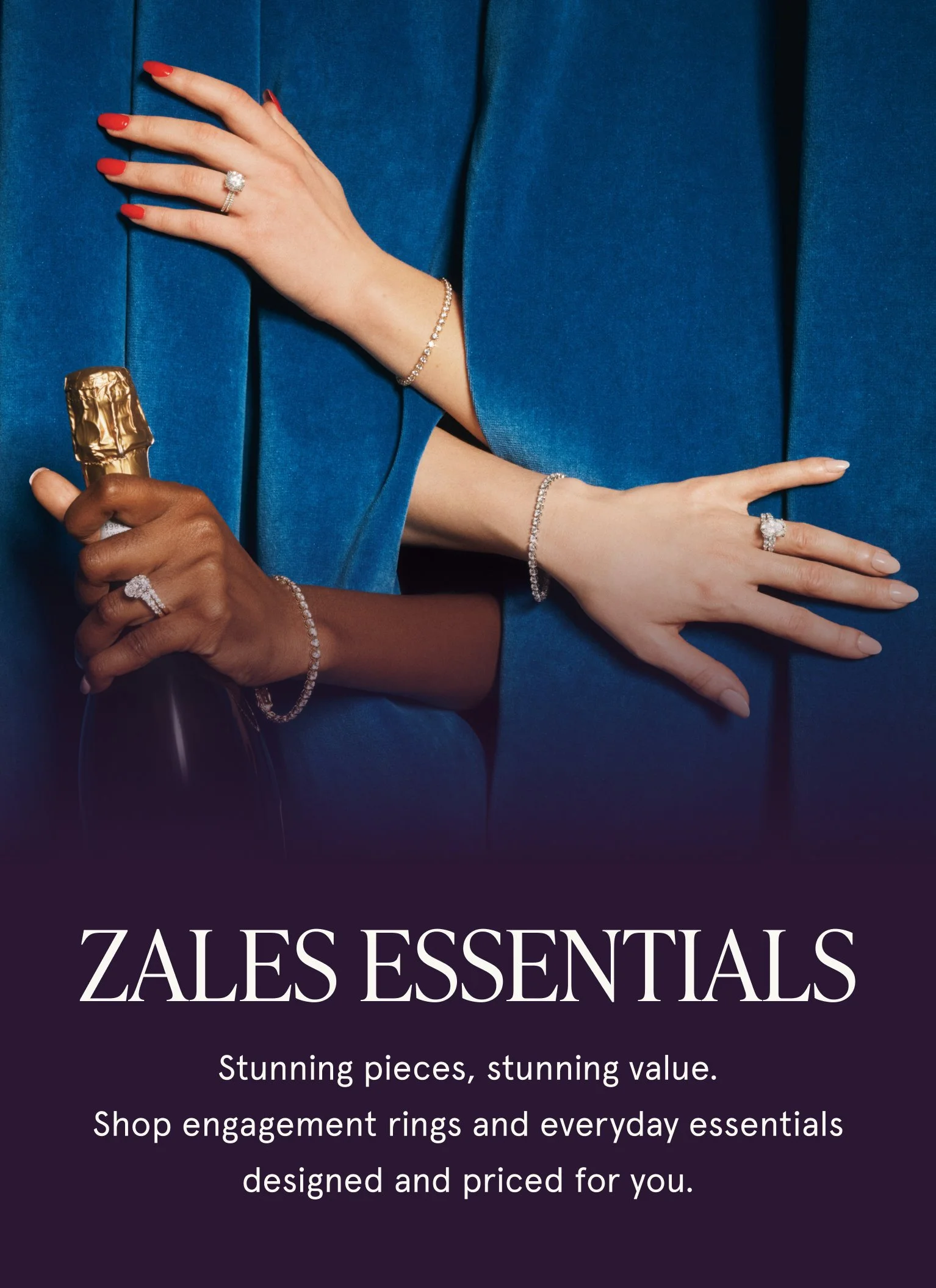
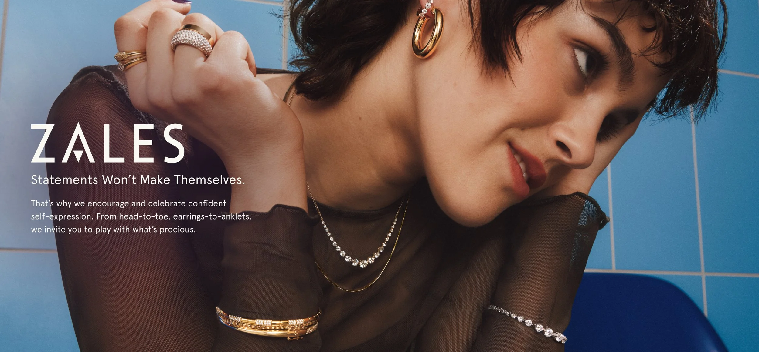
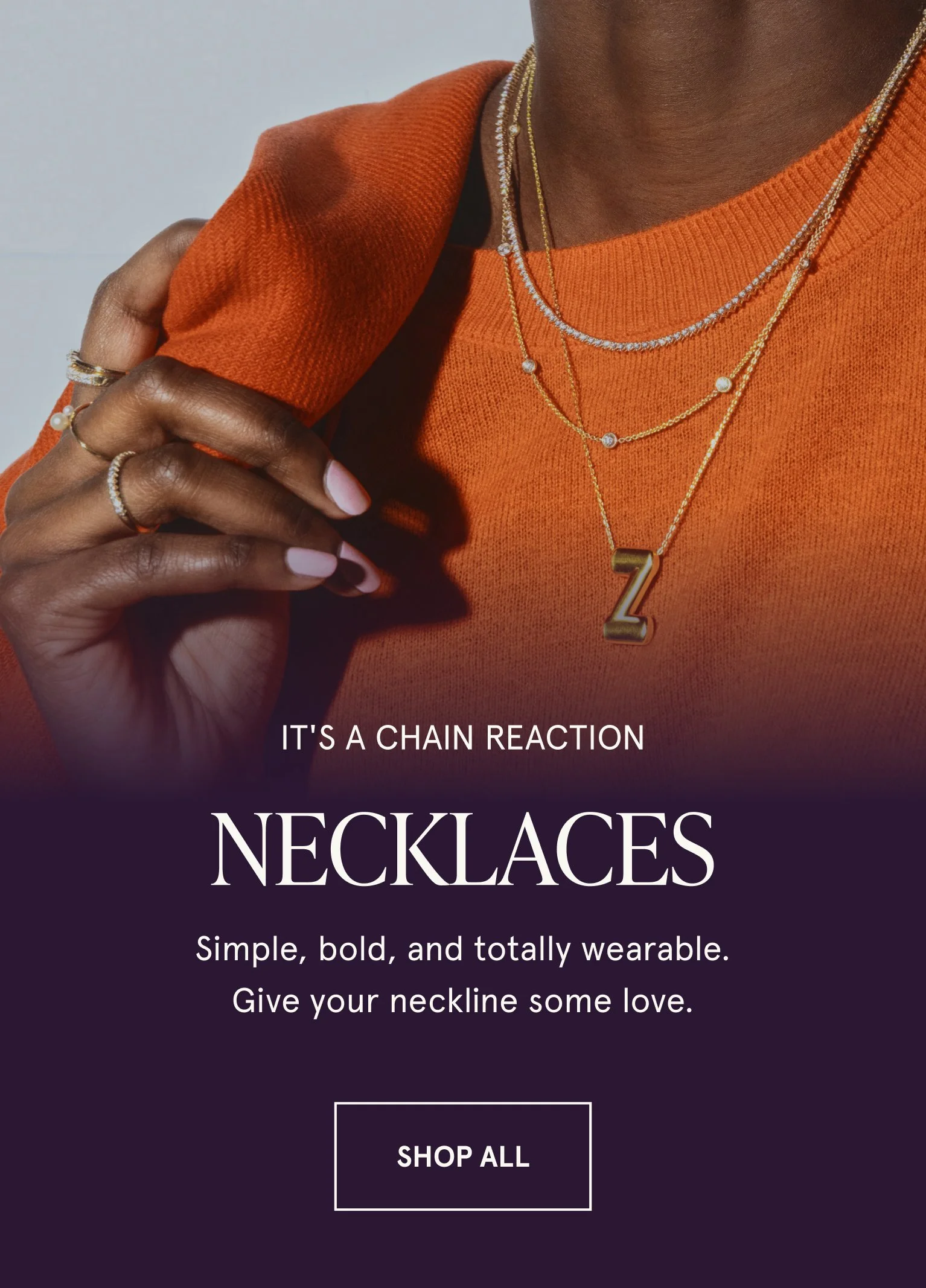
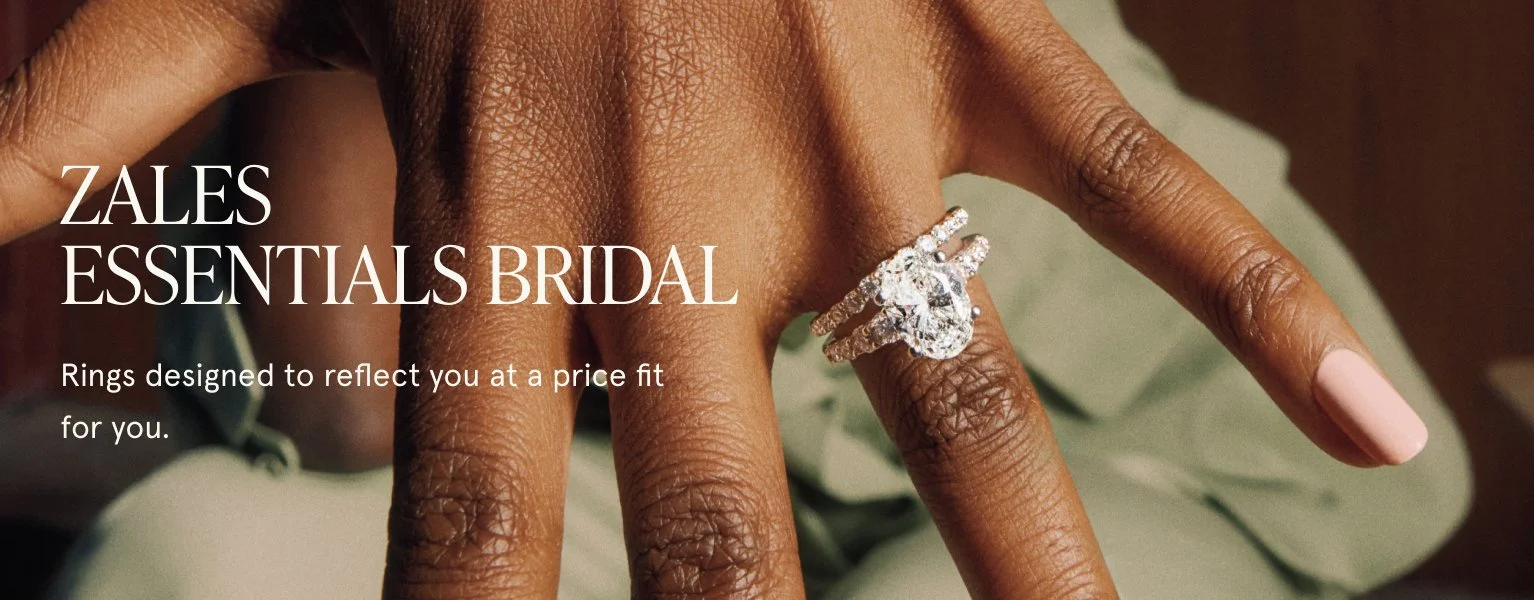
(ZALES) CRM + DIGITAL
55
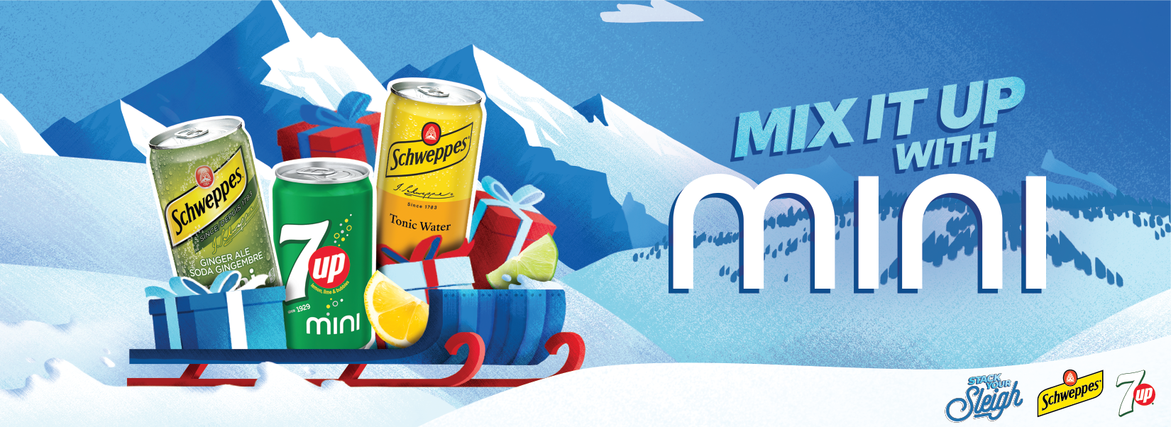
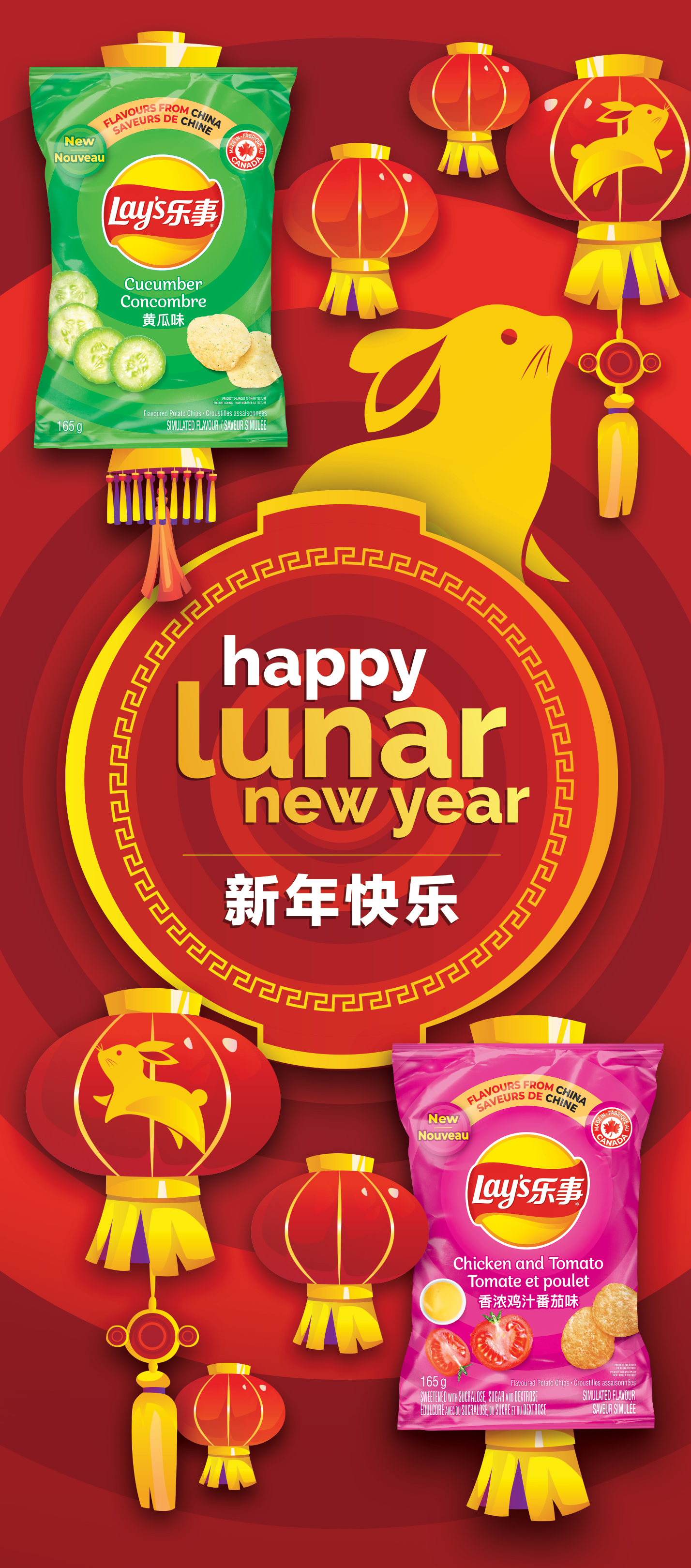
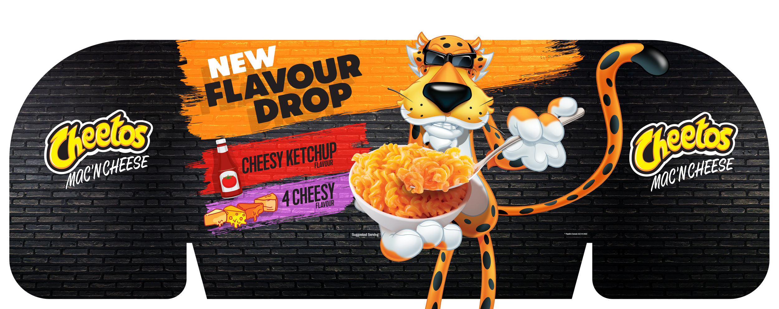
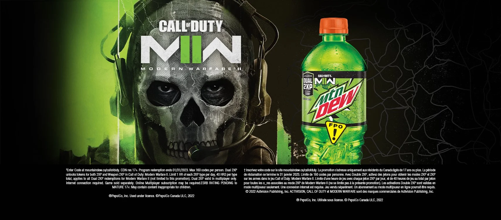
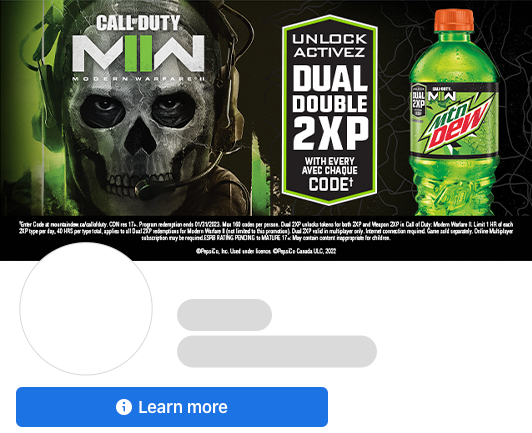
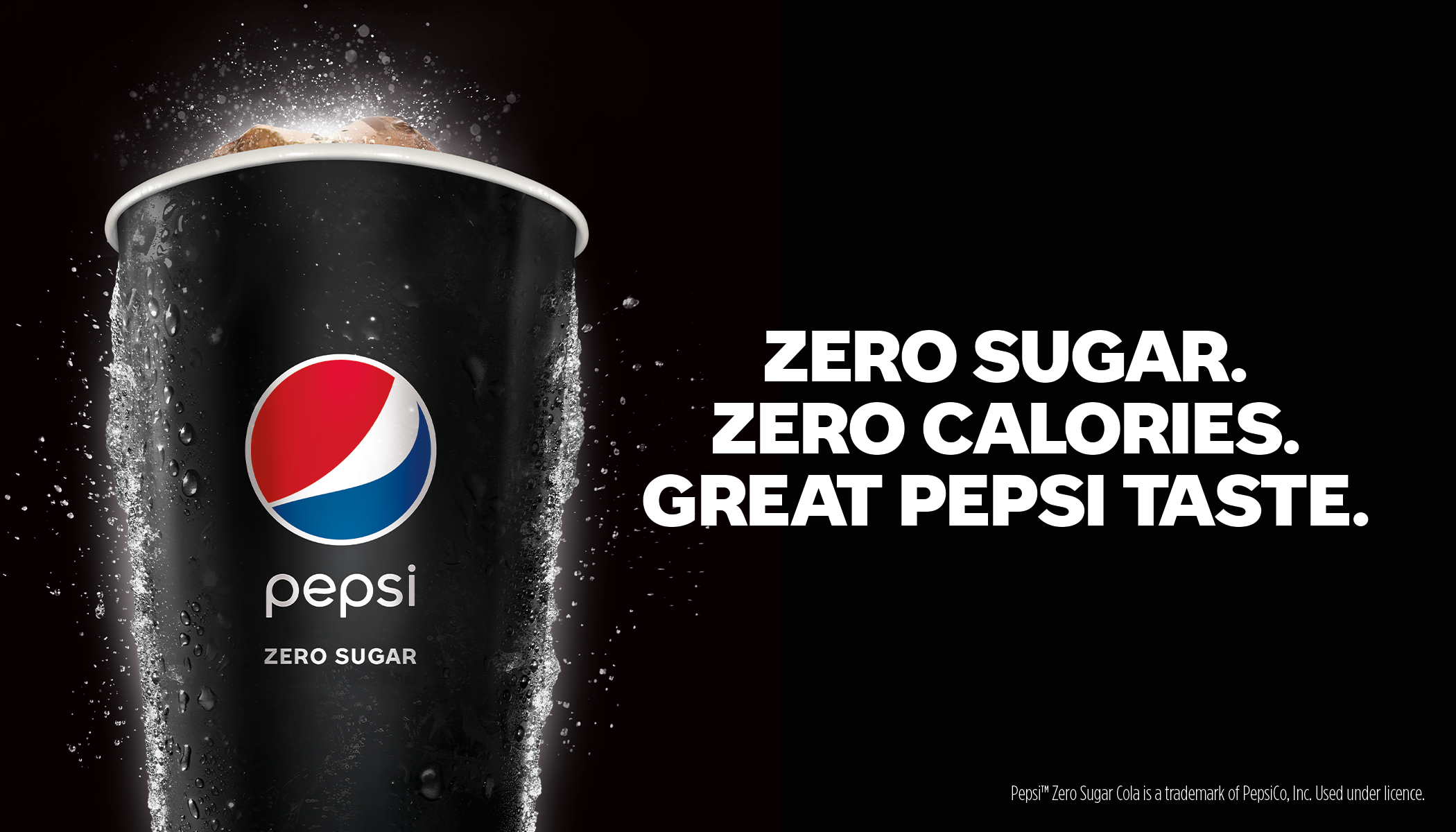
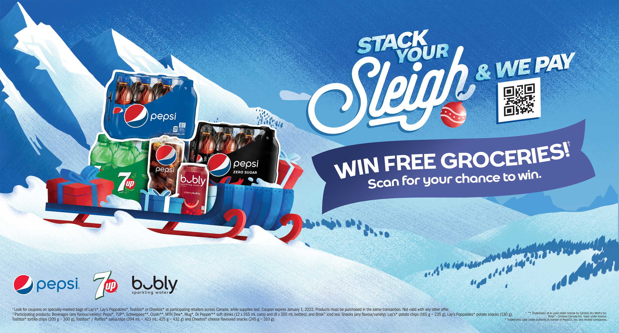
PepsiCo + FritoLay

56
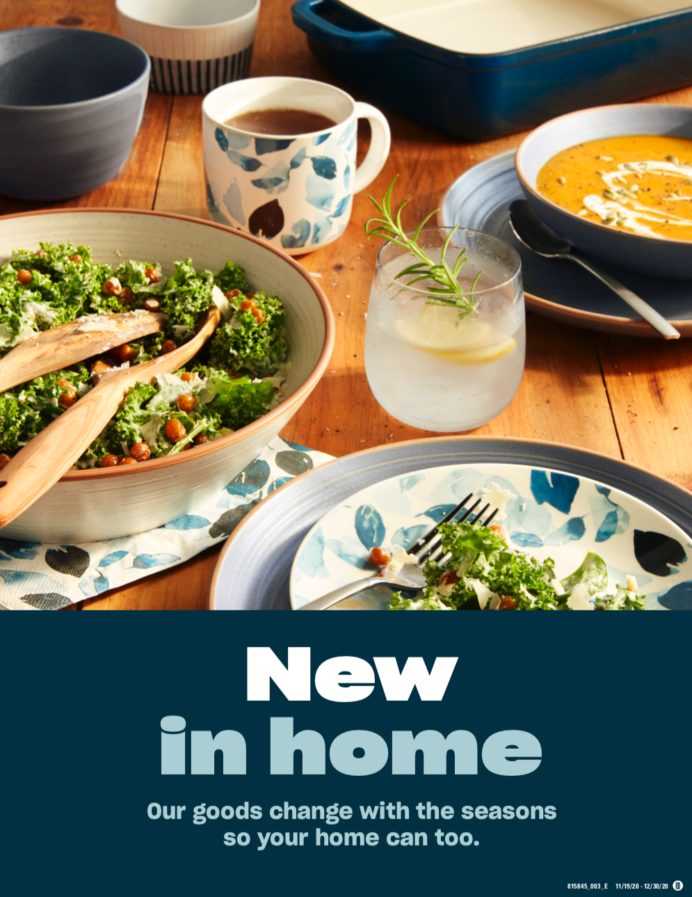
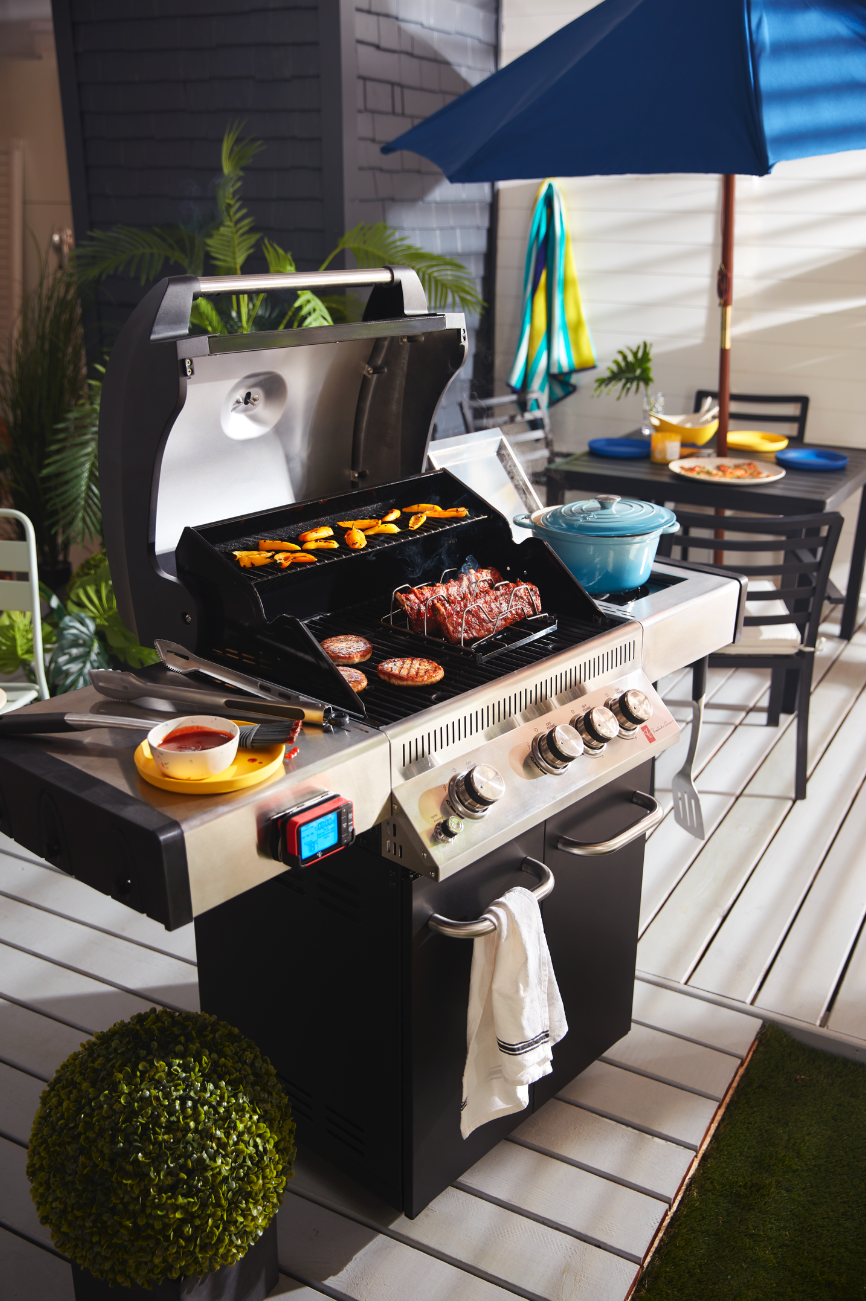
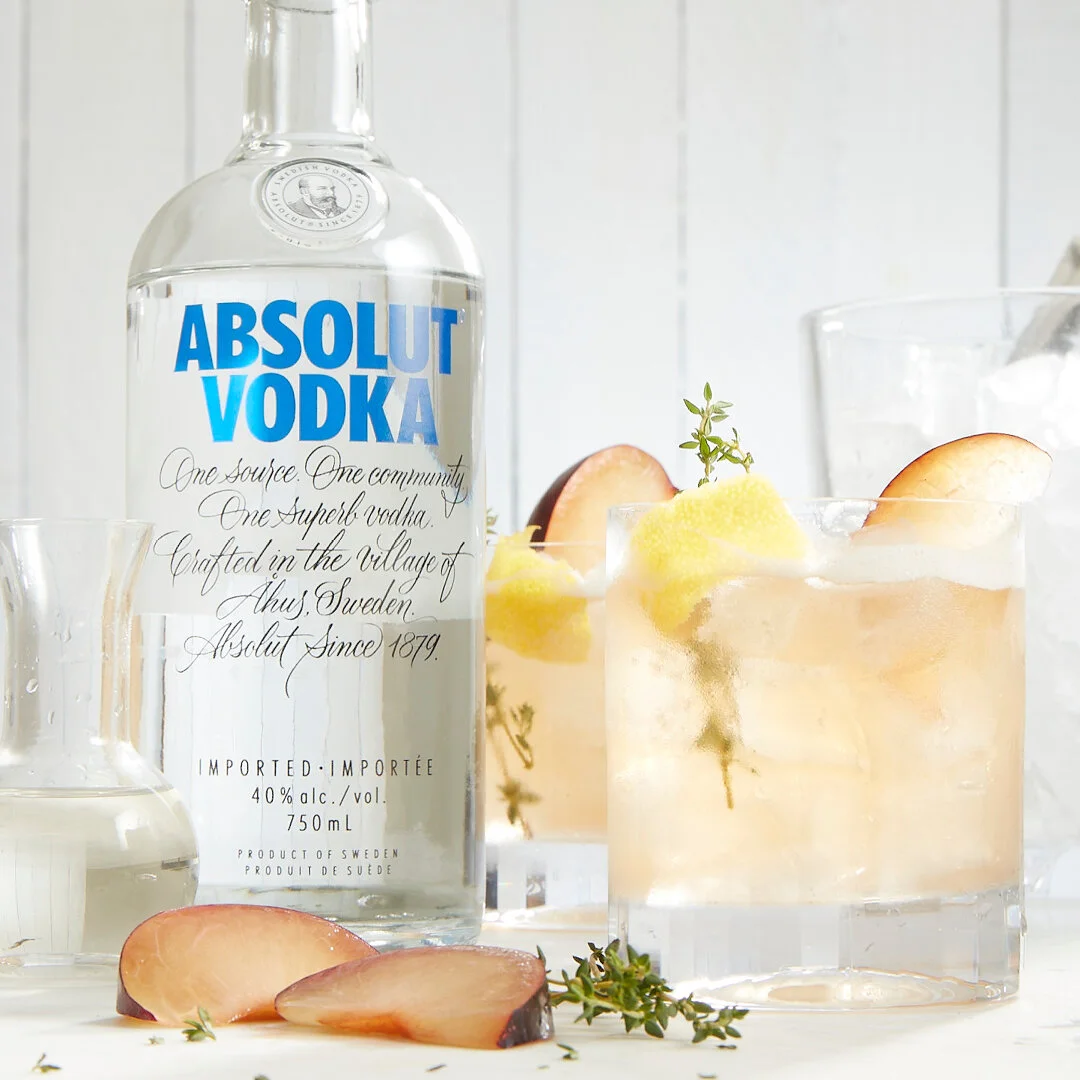
Loblaws Print + Digital Marketing

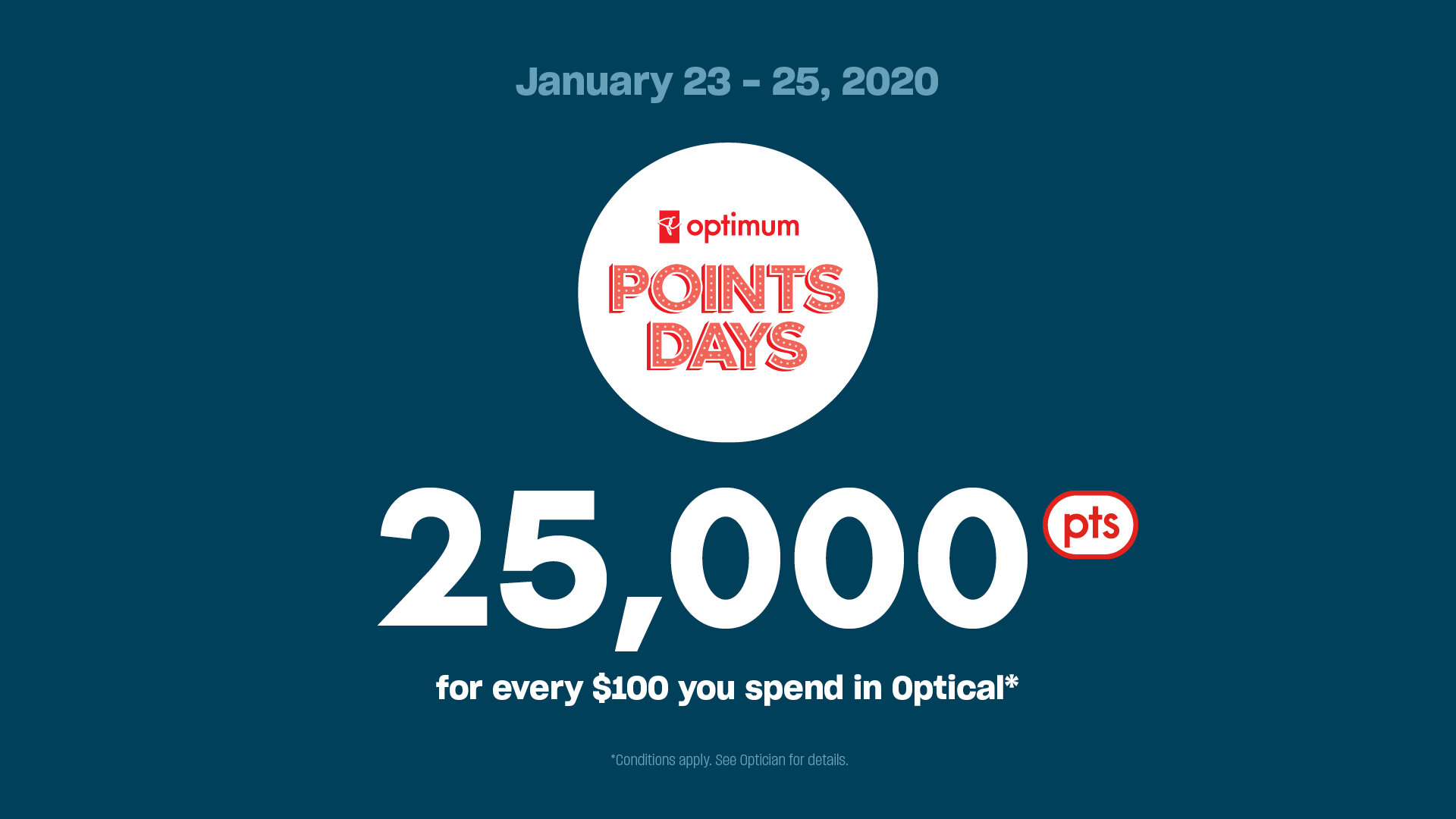
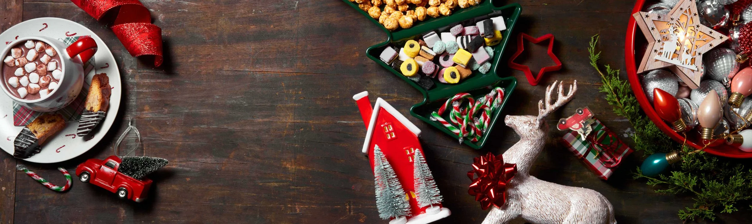
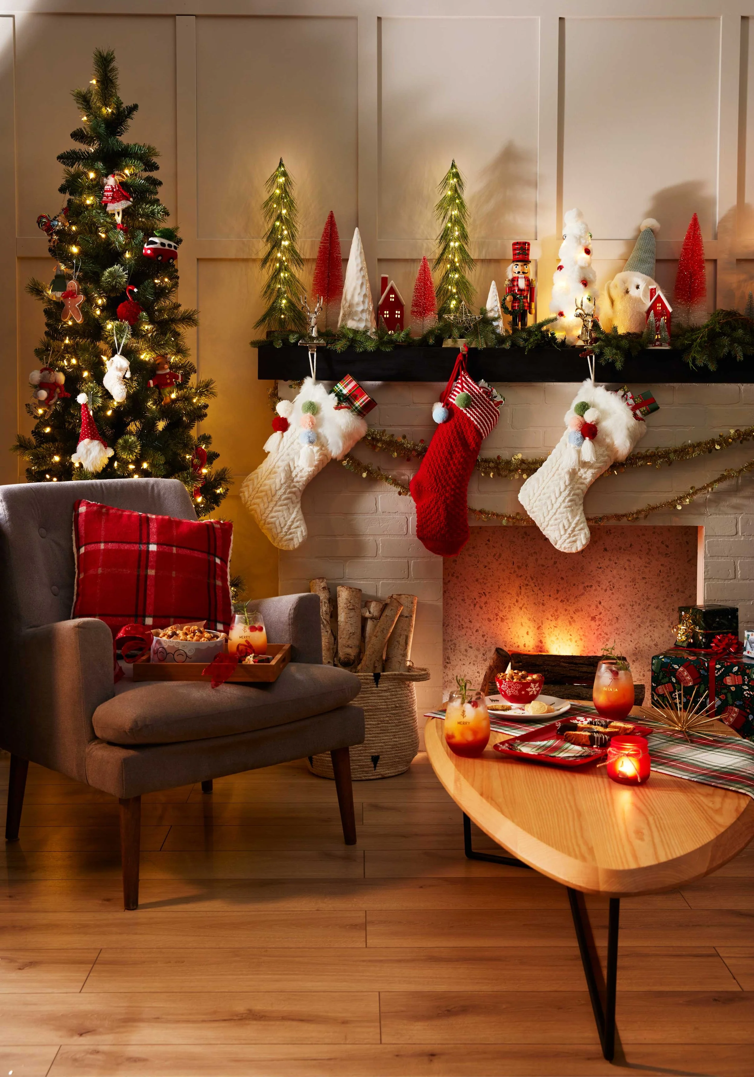
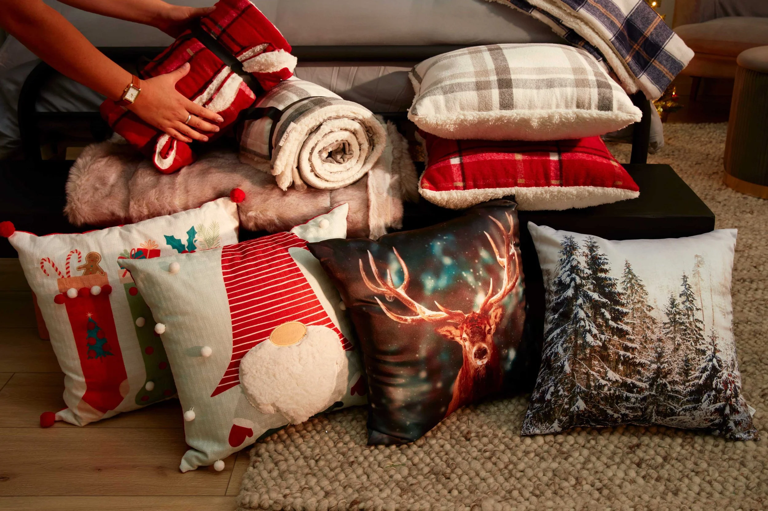
84
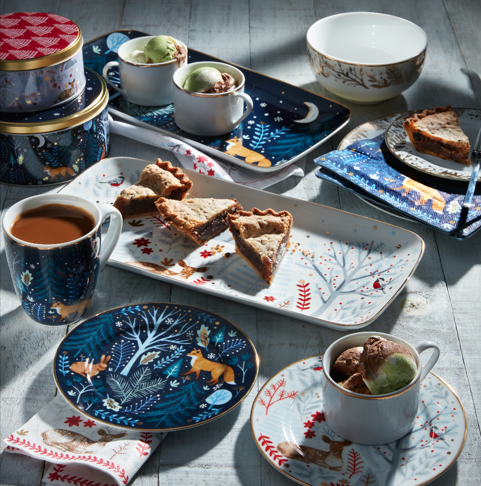
Loblaws Photography

29
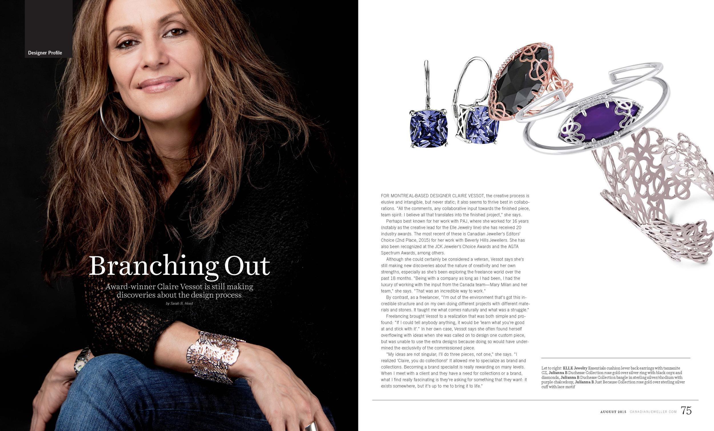
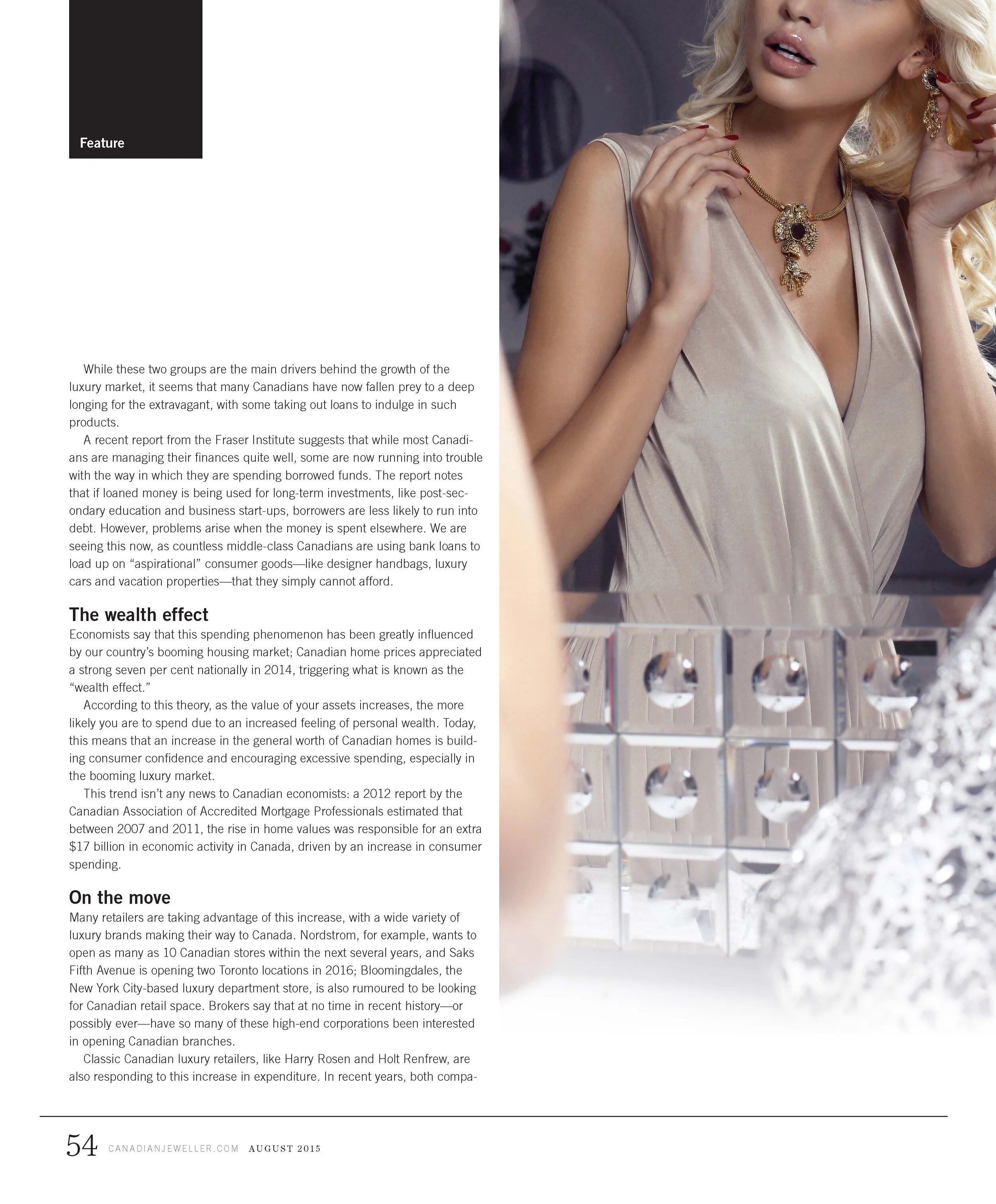
Canadian Jeweller Magazine

10
VIVA Magazine

5
WITTY: Women In Tech

4
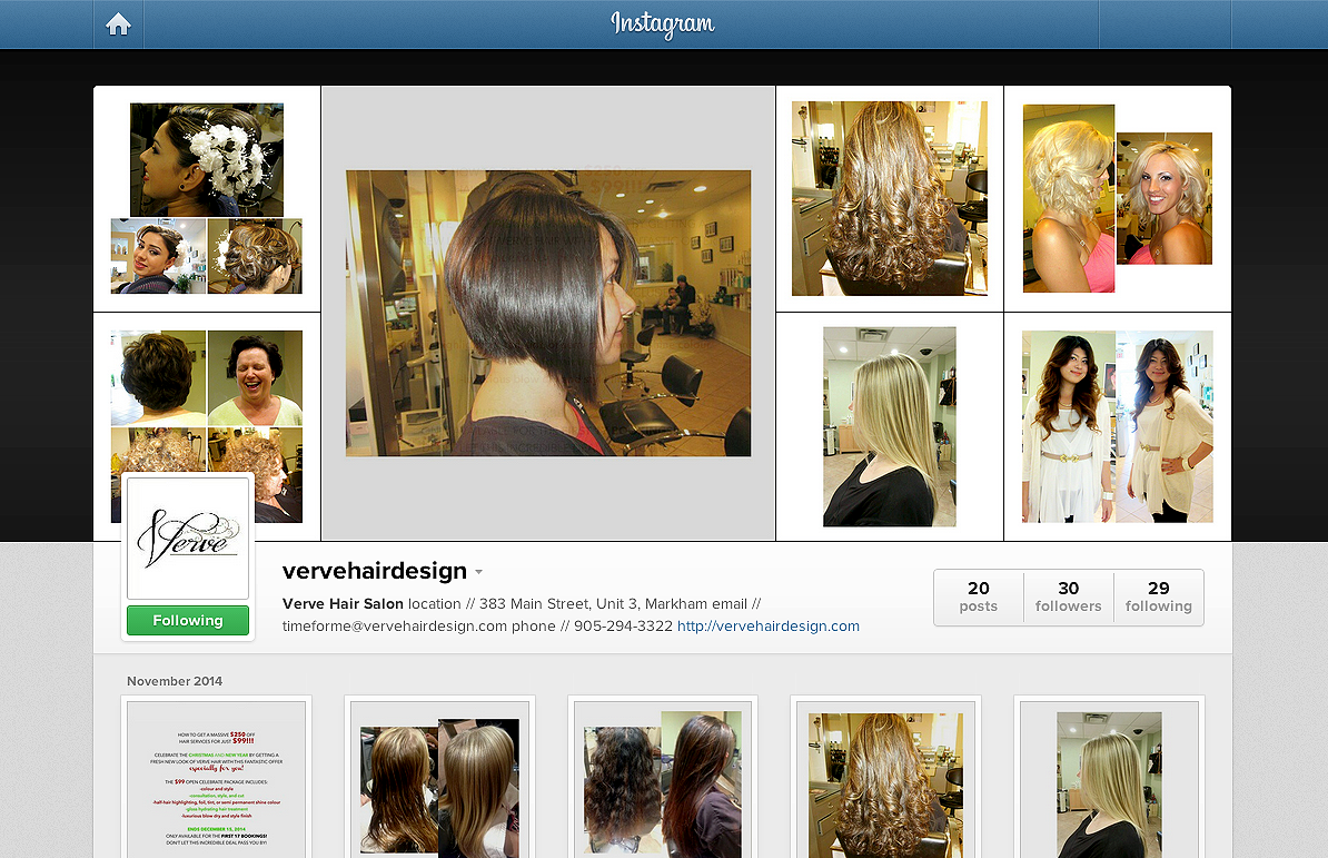
verve hair design
9
perceptions installation
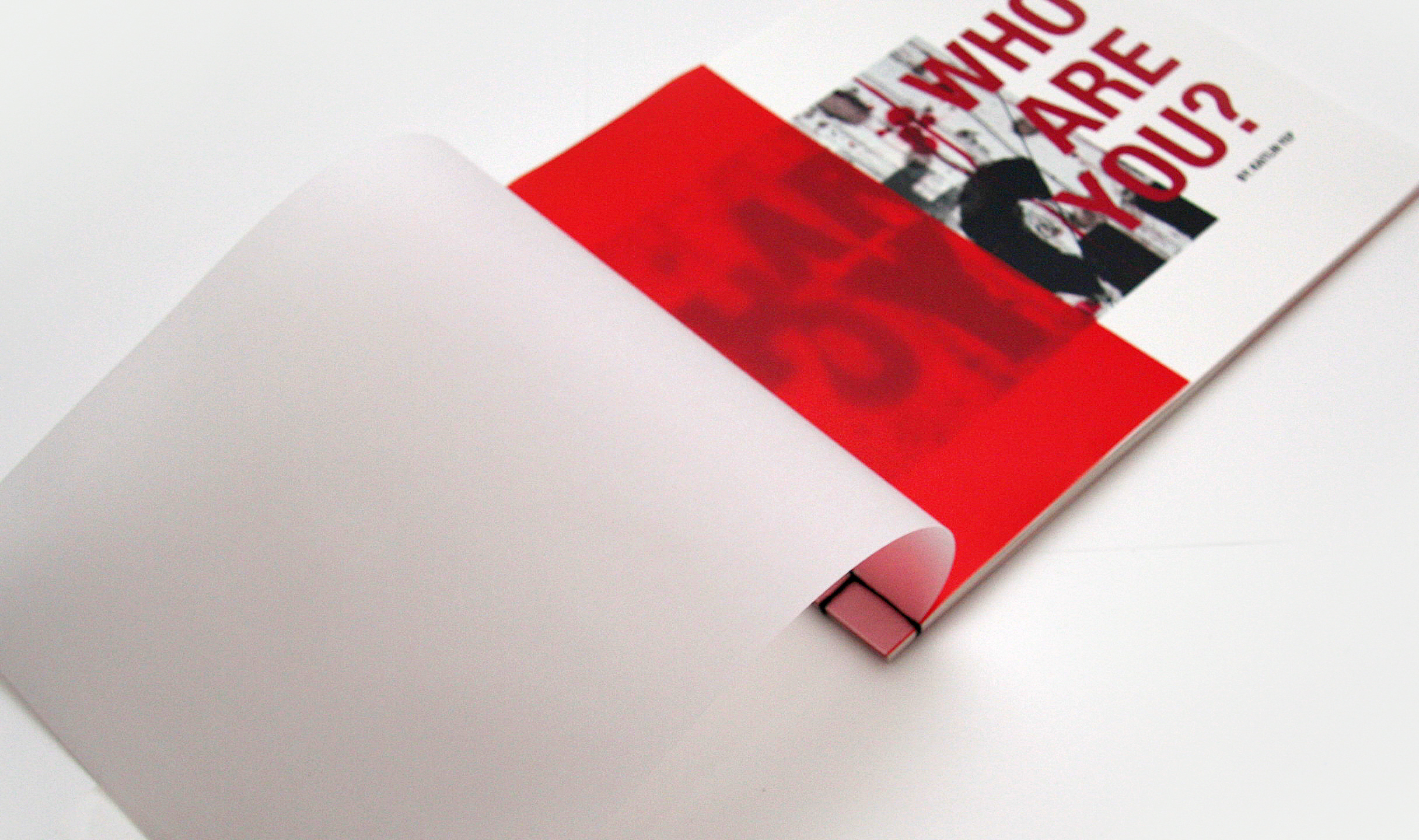
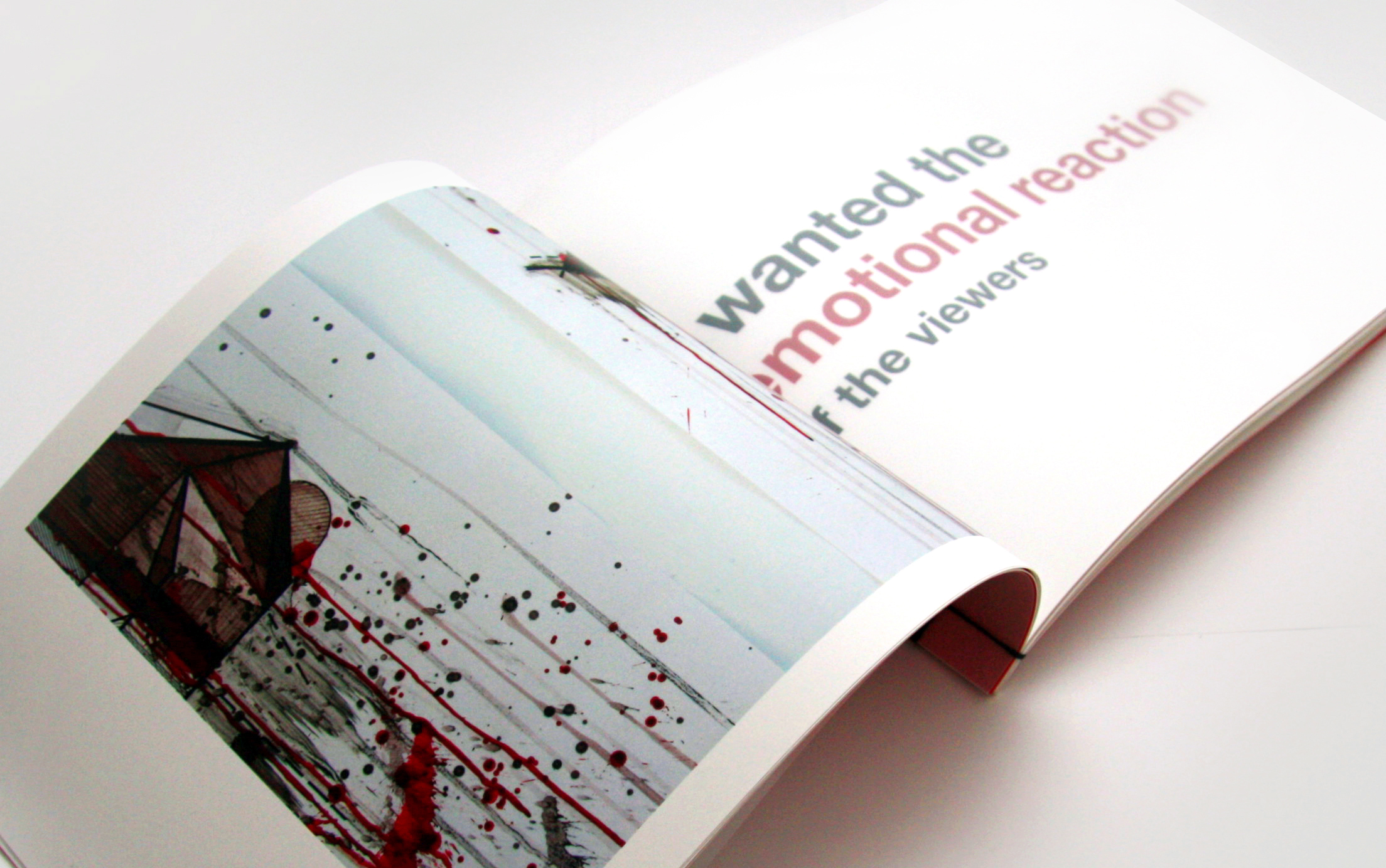
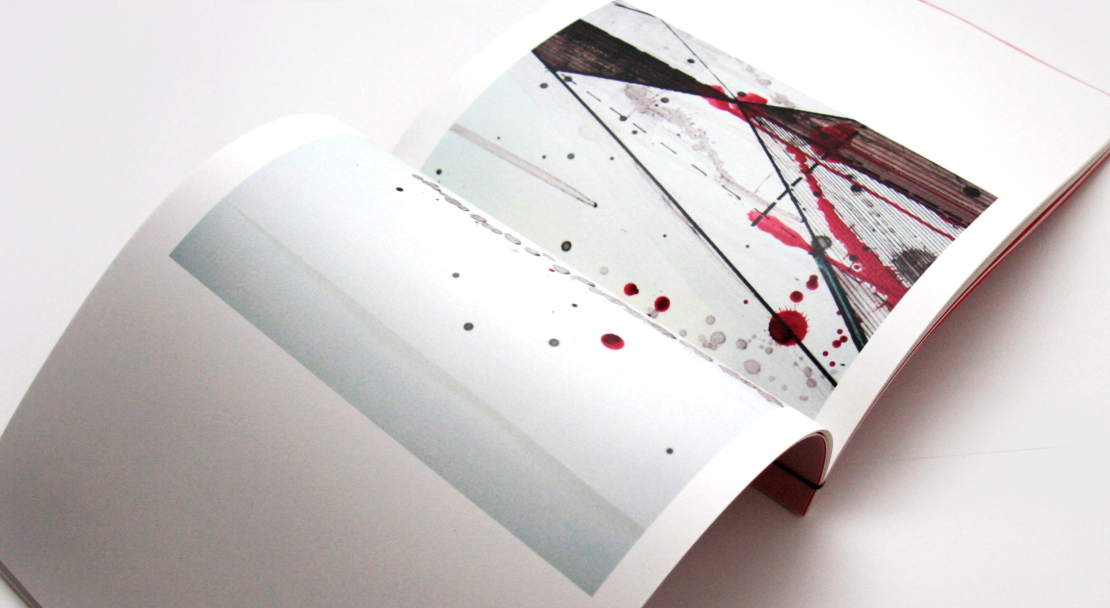
7
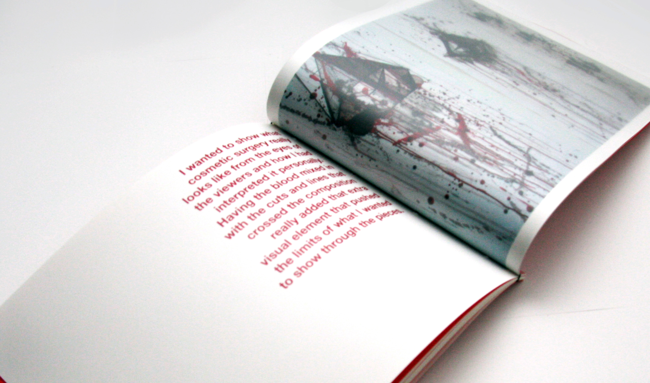
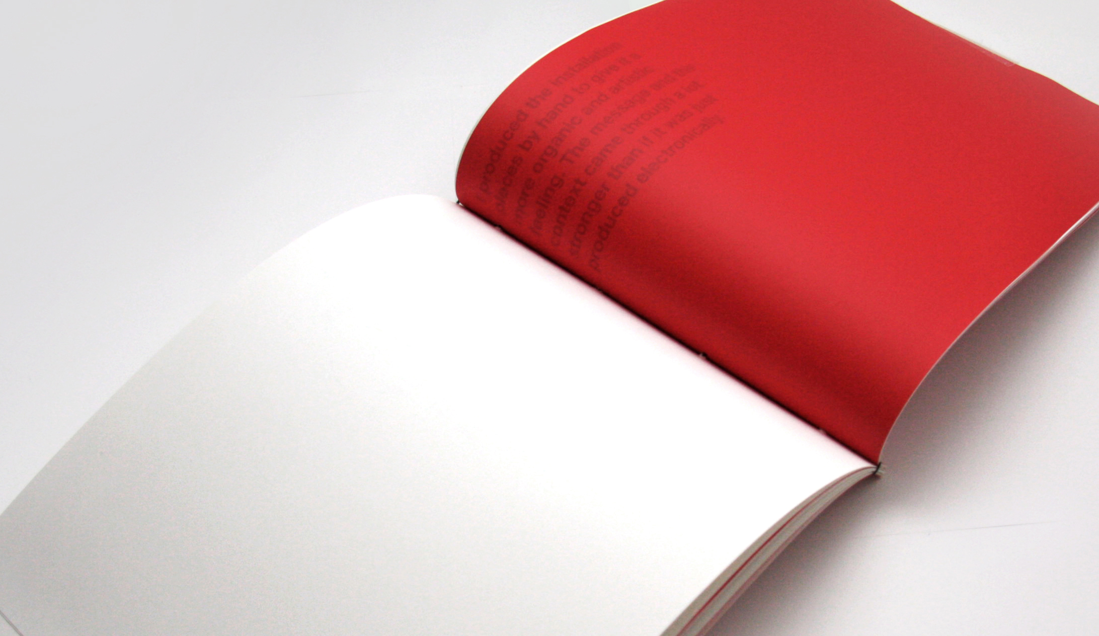
perceptions catalogue

9
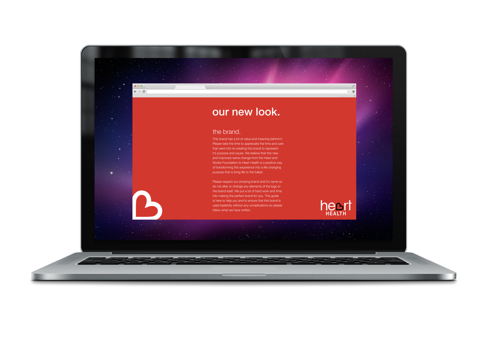
heart and stroke foundation rebrand
2
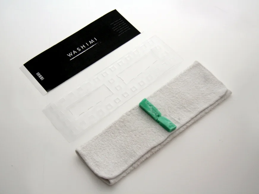
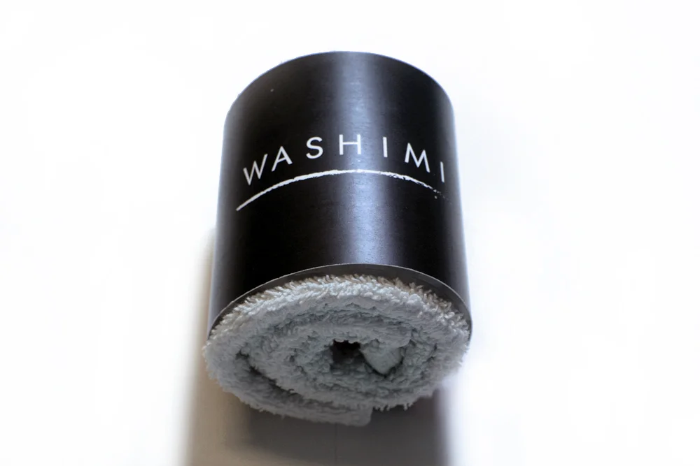
washimi package design
2
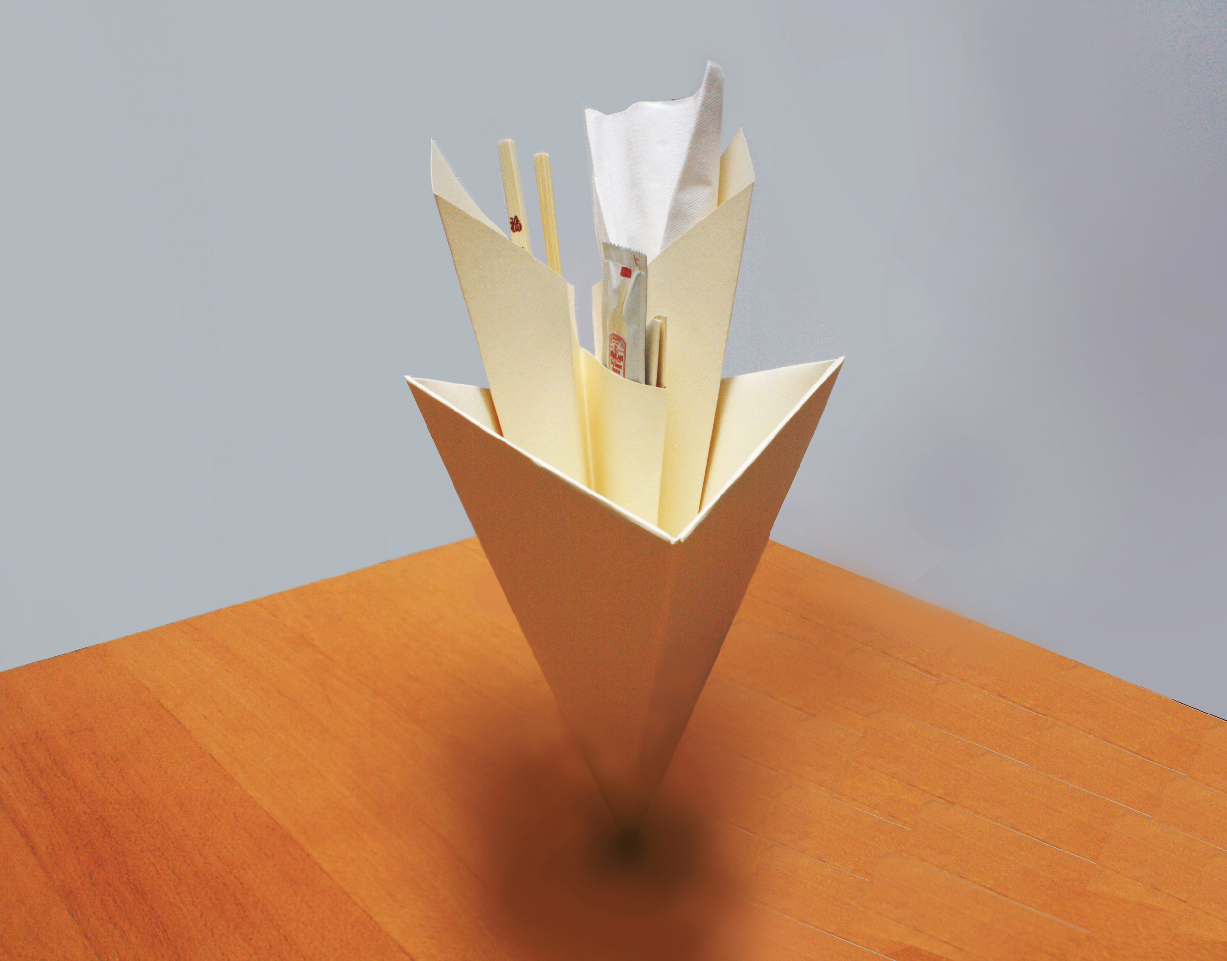
cone package design
10
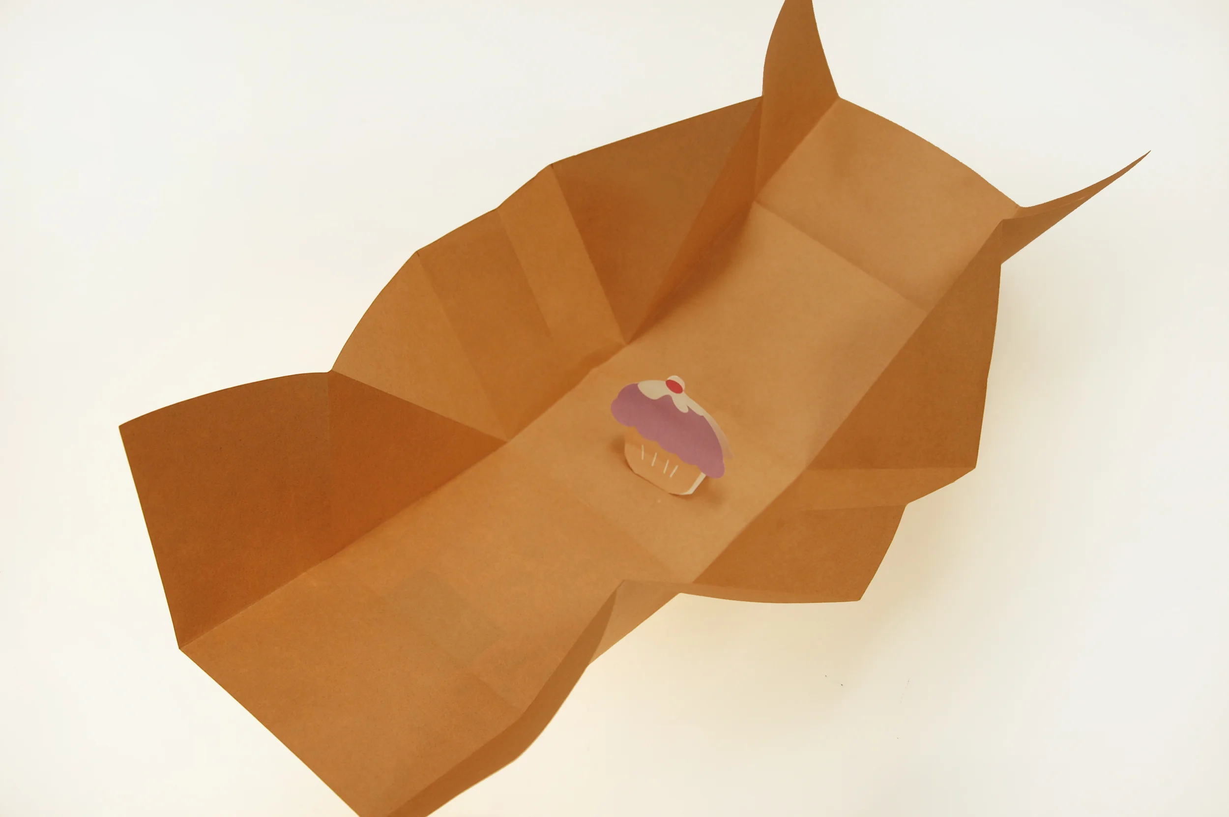
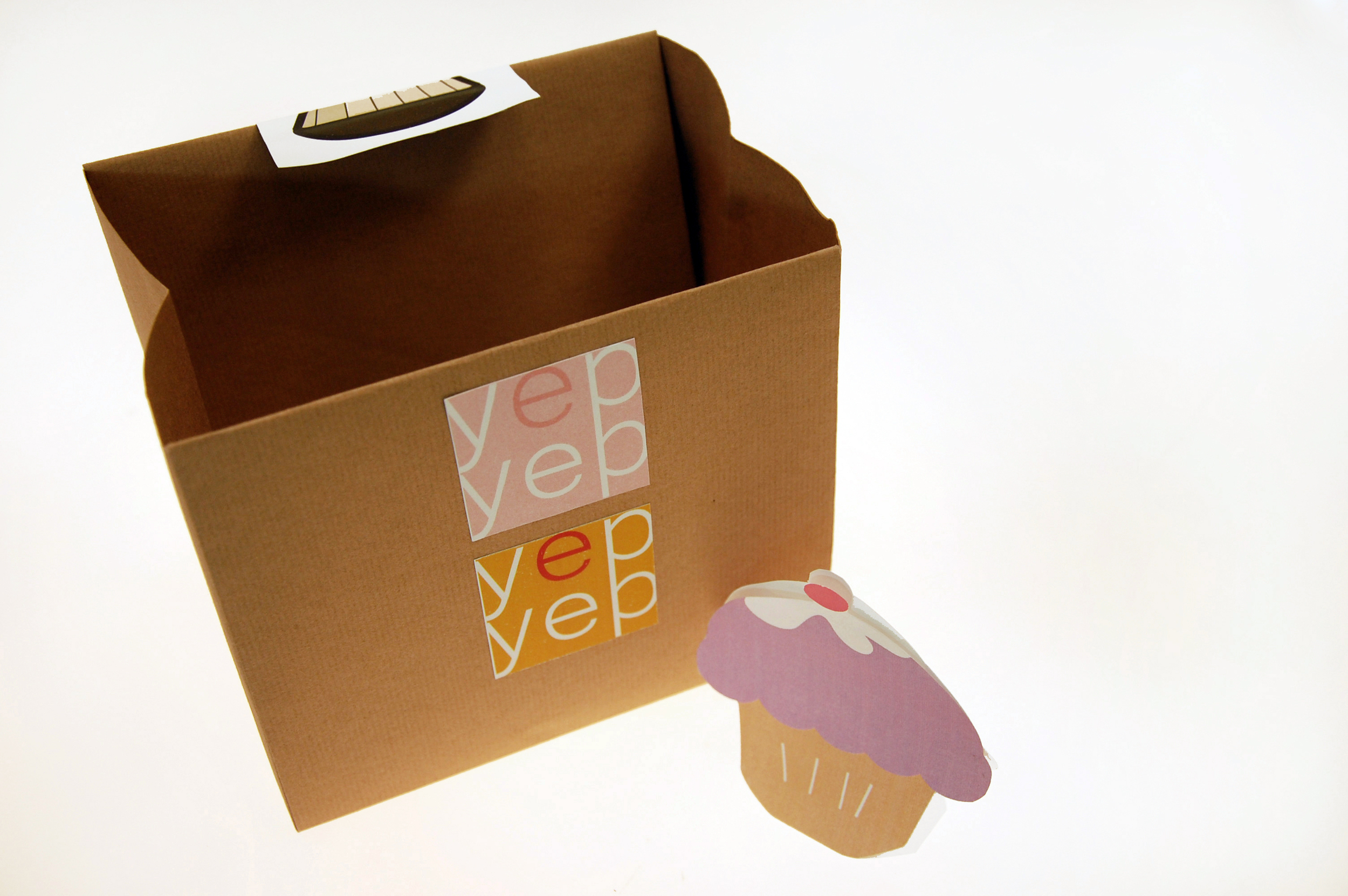
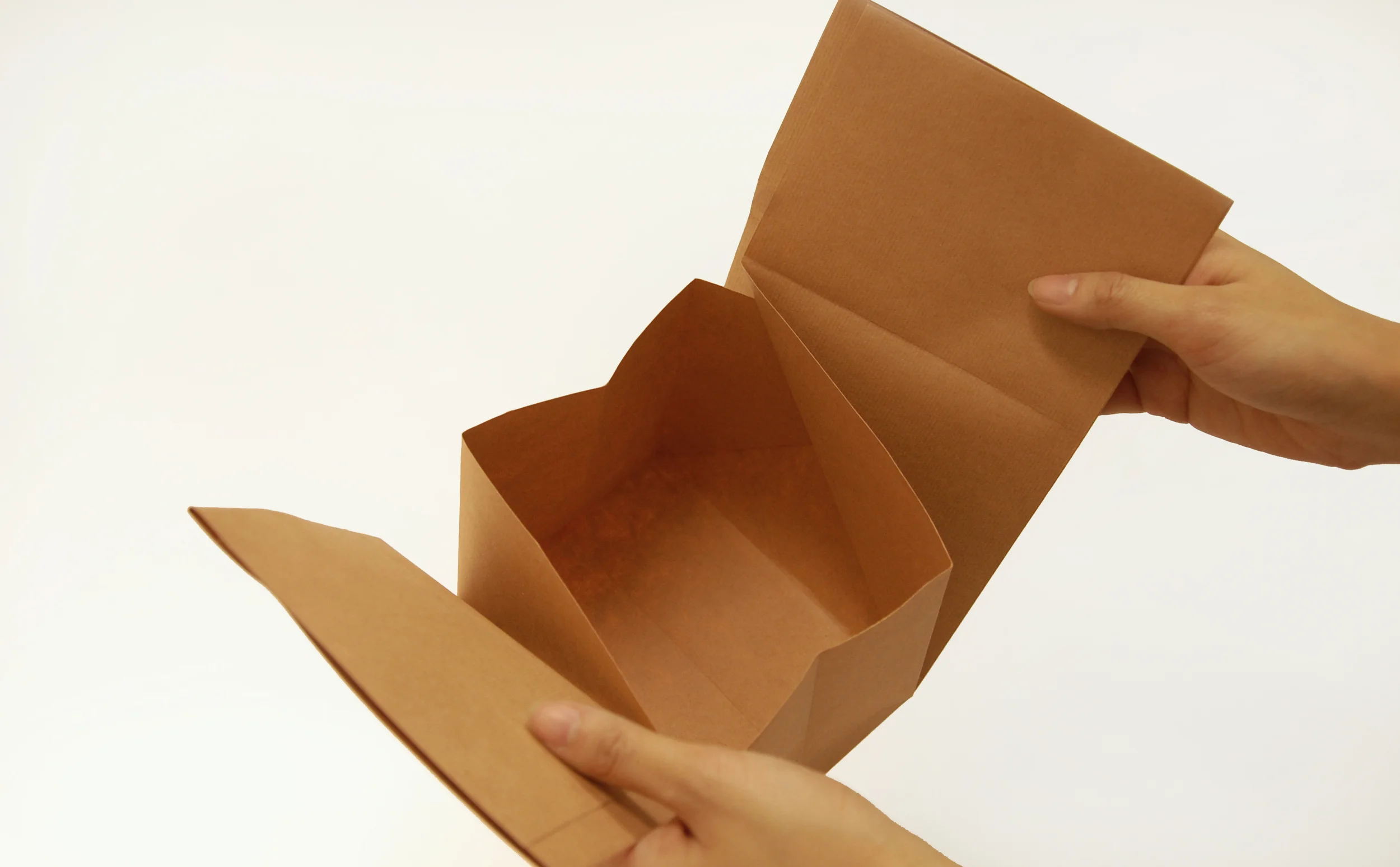
yepyep package design

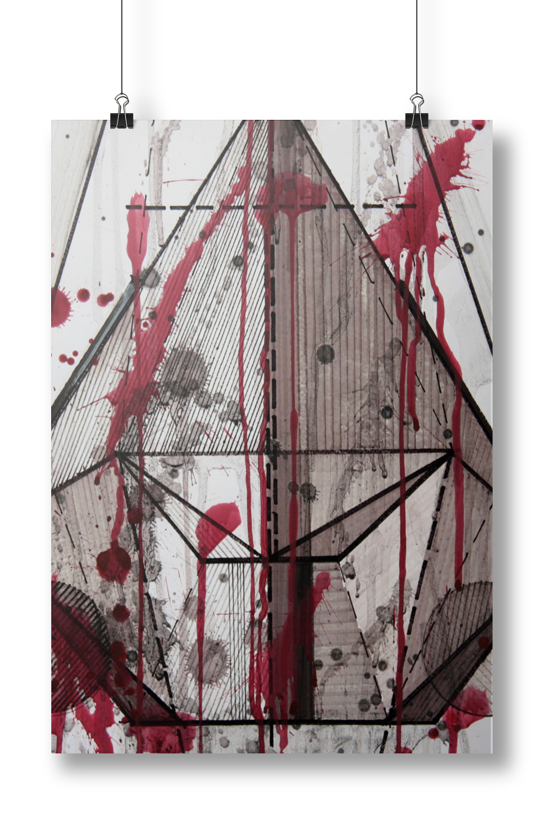
14
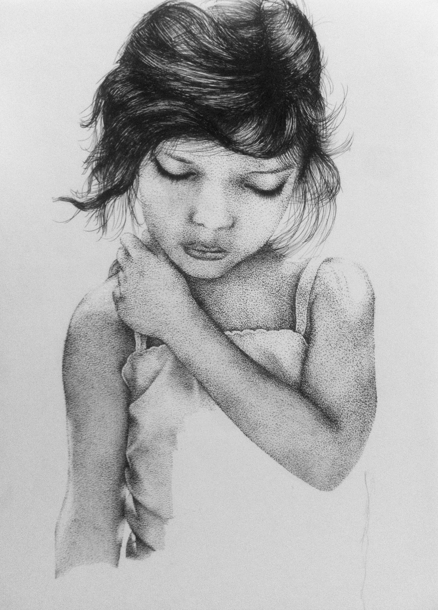
abstractions

2
paper sculptures // 3d design